Thai Ginger Branding Identity
2023
Overview
This project was for a Multimedia Design class at Washington State University. For this project my team studied the Pullman, WA restaurant ‘Thai Ginger’ and identified their current design problems.
Thai Ginger is a casual Thai/Asian restaurant offering a wide range of dishes for reasonable prices. Despite a large popularity and good praise, Thai Ginger suffers from many major design problems such as the lack of logo, a confusing menu, no social media prescence, and no unique packaging.
Team Roles
Elyse Tsu – Headed logo design/ideation as well as the poster designs.
Trinity Caputo – Headed packaging design and functions. Designed the artwork and elements used for the brand identity
Emily Tseng – Headed the social media campaign and designs. Compiled works into an aesthetic presentation
Ella Greenslade – Headed menu design and refinement, as well as leading the style guide design.
What I Learnt
This project was a helpful insight into creating a branding identity, as well as performing such a task with a team of desigers. During this project I learnt how to work with a team, and create cohesive design. This was one of the challenges as each designer has a different style, but we were able to communicate and effectively use the style guide to create a cohesive campaign. This project also helped me build skills in a variety of designs such as logo creation and packaging design.
Programs Used
For this project my team had a range of preferences for which programmes to use. Personally I used Adobe Illustrator and Adobe InDesign for the menu design. Trinity used Procreate to draw the campaign elements and art. Elyse used Adobe Illustrator to design the posters and logo, and Emily used Canva to create the social media posts and to compile the presentation. The team used Adobe Photoshop to create the mockup images.
Old Branding:


Logo & Icons
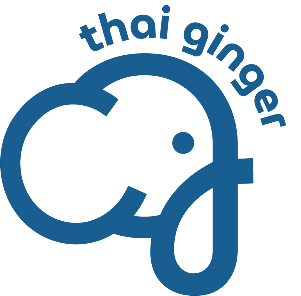
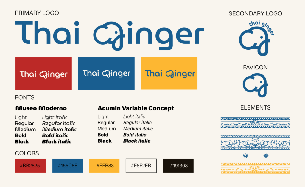
The primary logo at the top includes the full Thai Ginger restaurant name, with the ‘G’ being transformed into an elephant to represent the Thai roots. This logo will be used on the restaurant signs, along with packaging, posters, social media content, etc. where space is available.
The secondary logo is a reduced version of the primary logo, but still includes the restaurant name as an identifier. This logo will be used in branding where space might be limited such as social media content or packaging.
The final logo is just the elephant design and is in its fully reduced state. This logo does not include the restaurant name for identification and so is not often used. This might be used as a favicon, or when identification is not needed, such as the restaurant menu.
Style Guide
We chose five colours including an off white and off black. The blue, red, and yellow/gold helps to identify the Asian/Thai elements of this restaurant to consumers.
This is the same with the elements that Trinity designed. These elements are inspired from Thai artwork, and are used across the campaign to convey this.
We chose two typefaces, Museo Moderno and Acumin Variable Concept. Museo Moderno will be used for headings/logo/etc., while Acumin Variable Concept is used for body copy and text with lower heirarchy. Together these two fonts allow for a modern feel, but don’t distract from each other.
Menu Design
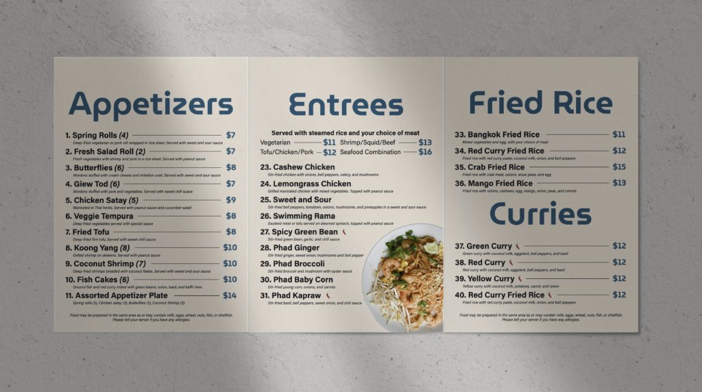
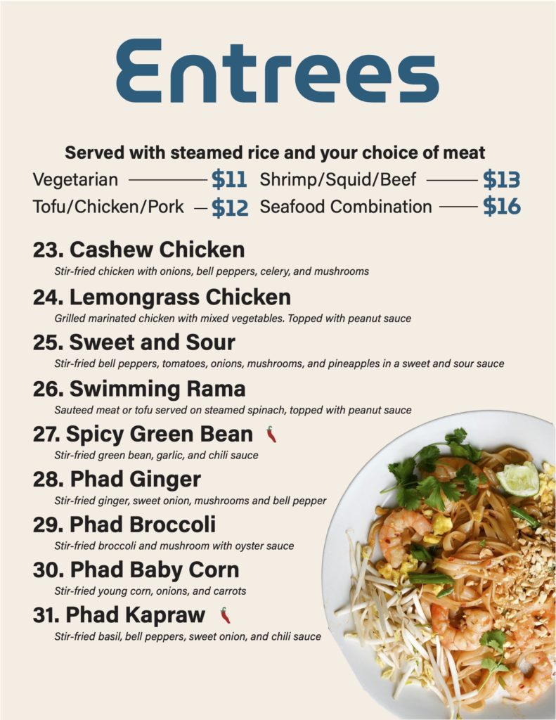
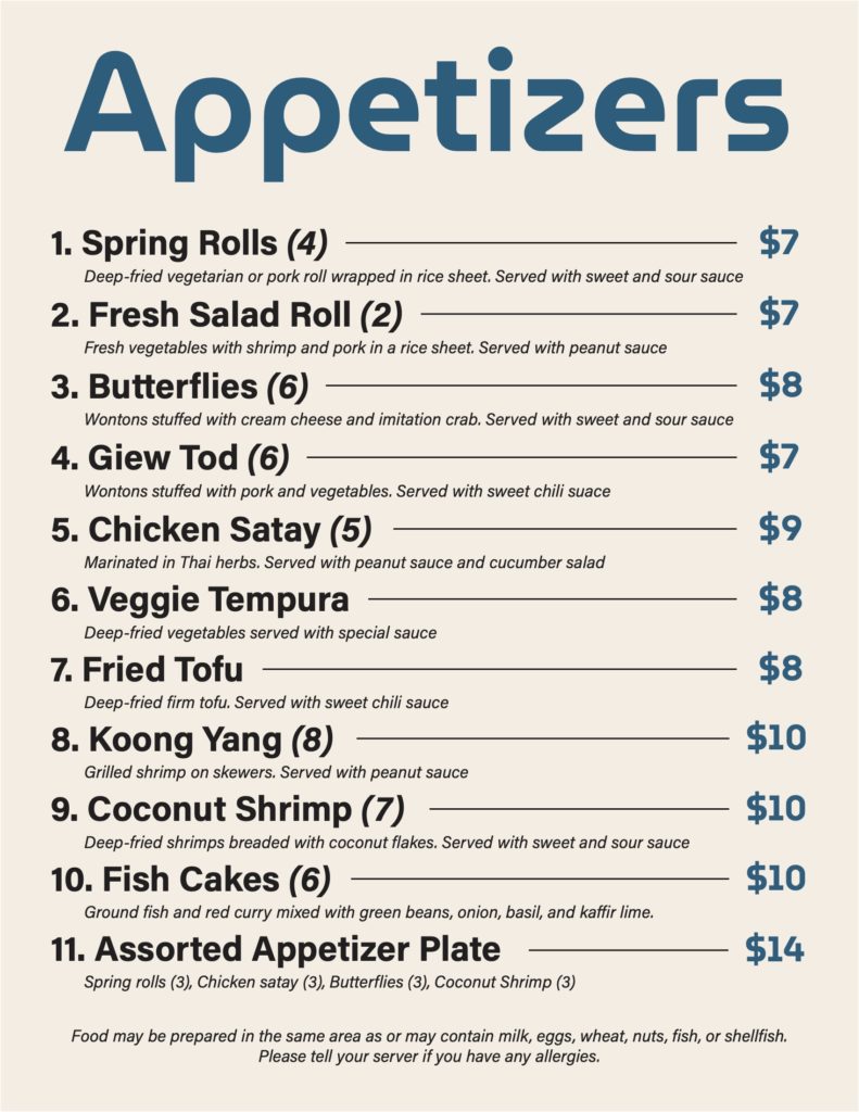
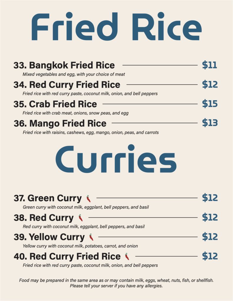
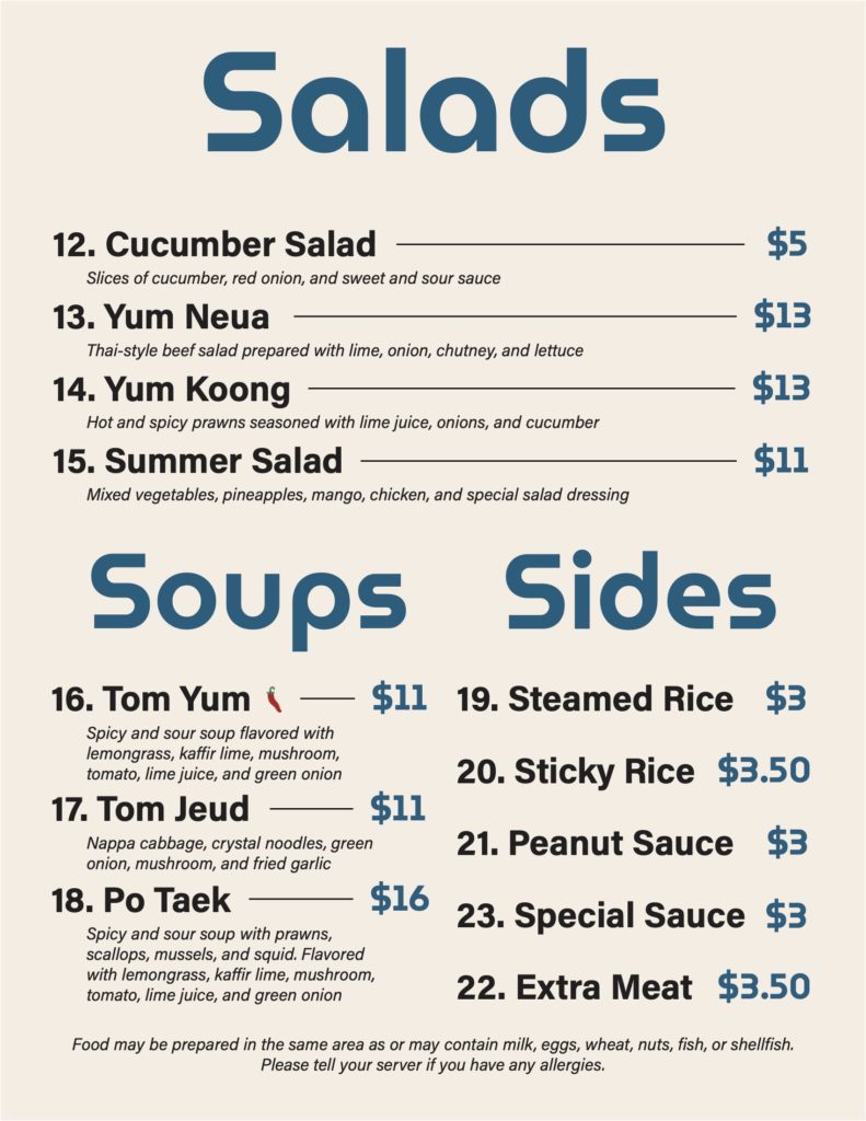
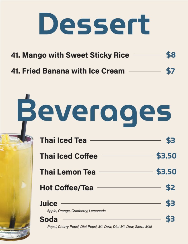
One of the key goals for this design was to simplify the original menu and create a heirarchy that allows customers to quickly scan and analyse the menu. This has been done by making large headings, clear prices, and clear markings for spicy dishes, etc.
This menu is designed with a tri-fold. After opening the front page, you see the ‘Appertizers’ page on the left and the ‘Soups, Salads, Sides’ page on the right. By unfolding the right page, the ‘Entrees’ and ‘Fried Rice, Curries’ pages are revealed. When you flip the menu and look at the back you will see the front page, on the right, the ‘Desserts, Beverages’ page in the middle, and the ‘Salads, Soups, Sides’ page again on the left.

Posters
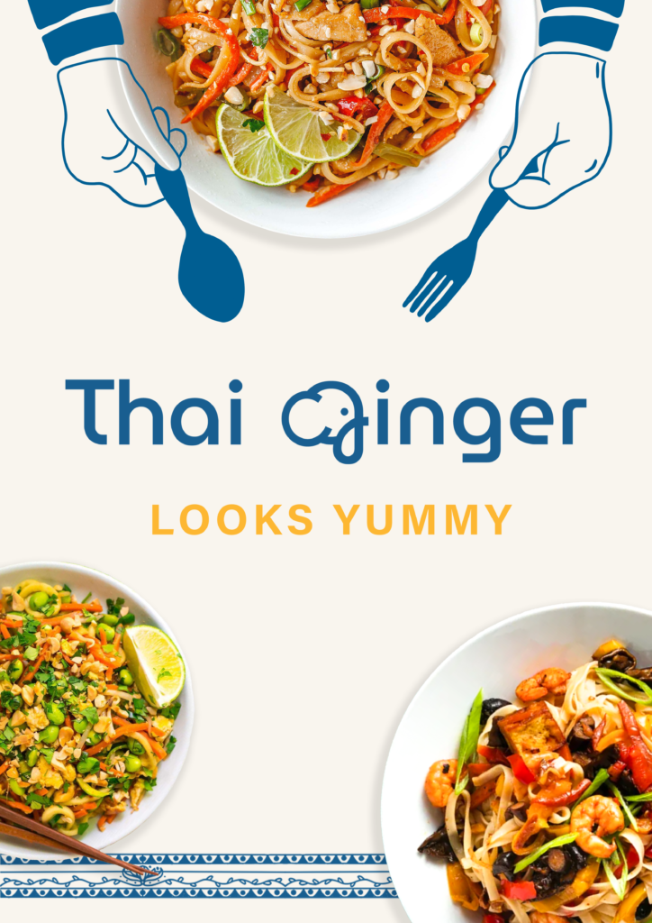
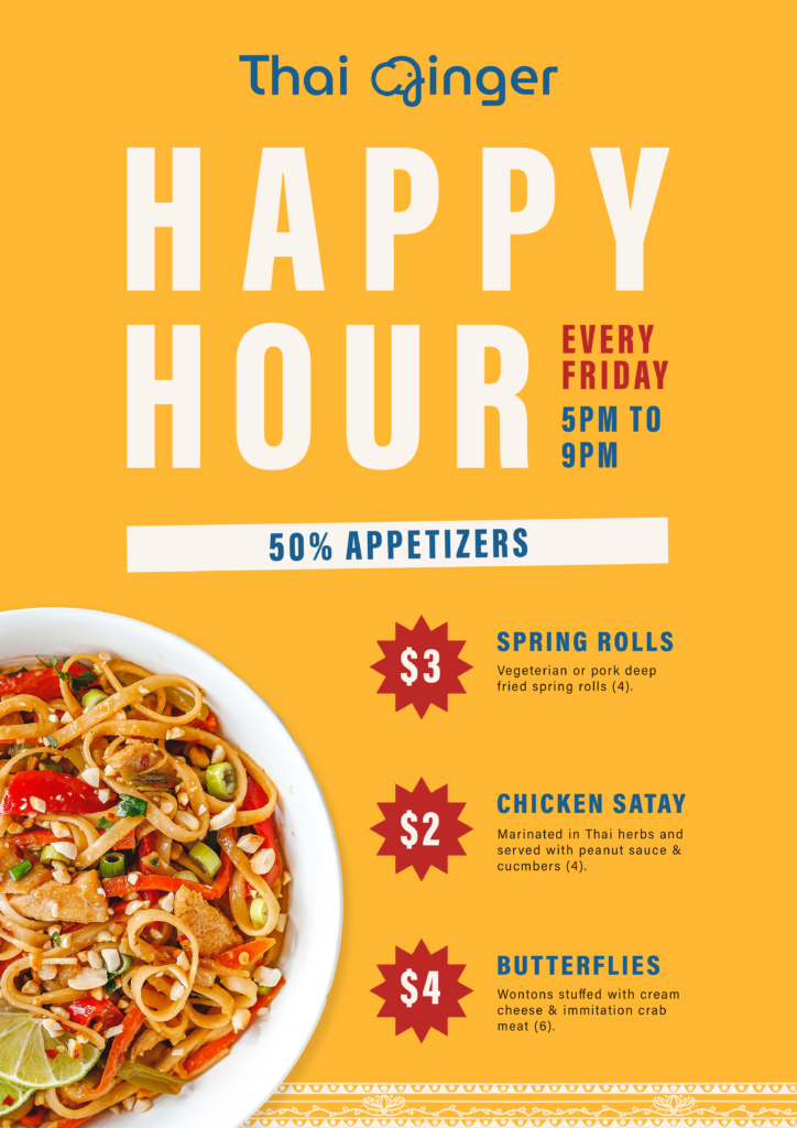
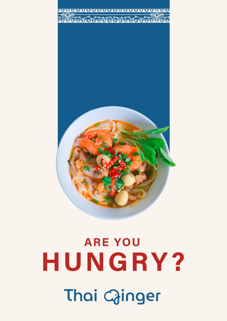
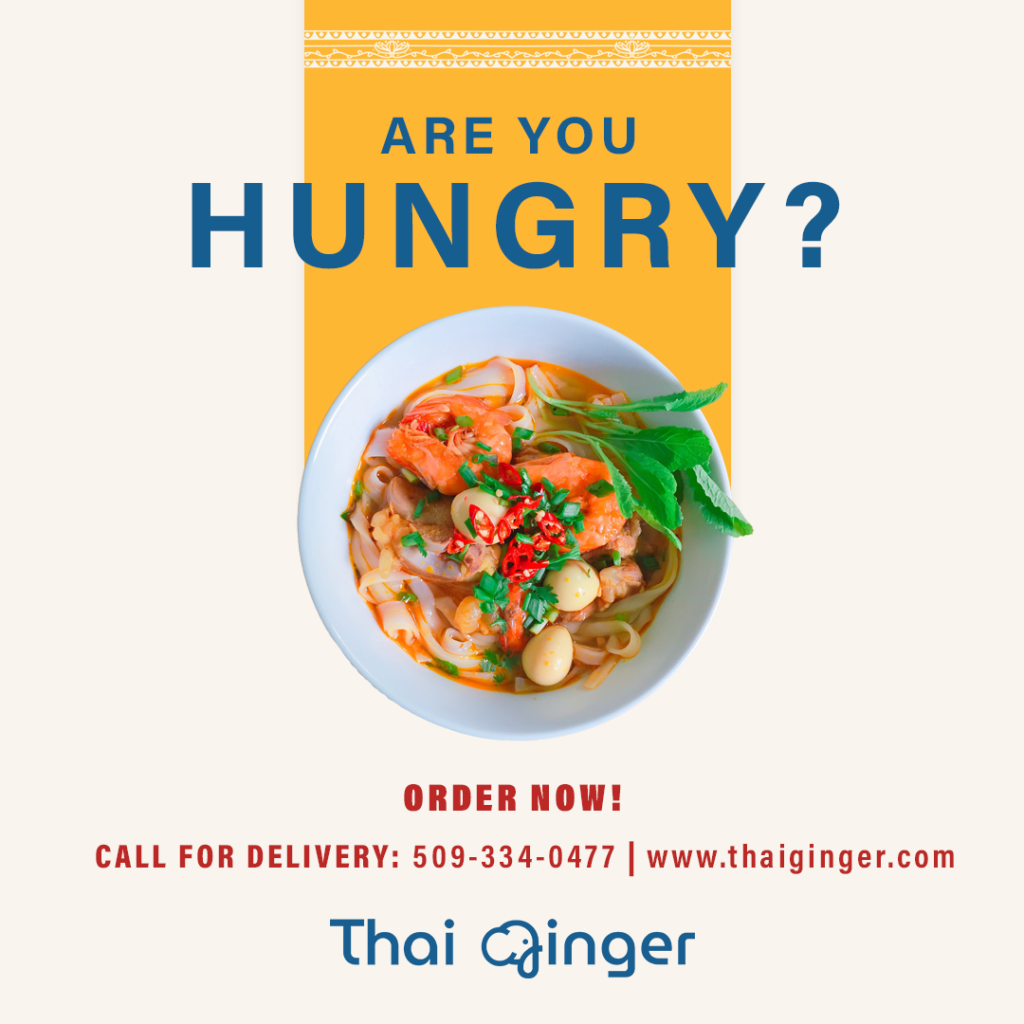
The poster designs were one of the key designs that tie the branding altogether. Elements such as the images of Thai food can be found throughout the brand identity such as in the menu and social media posts. Other elements such as the artistic Thai patterns can be found in the social media posts and the packaging.

Social Media Posts
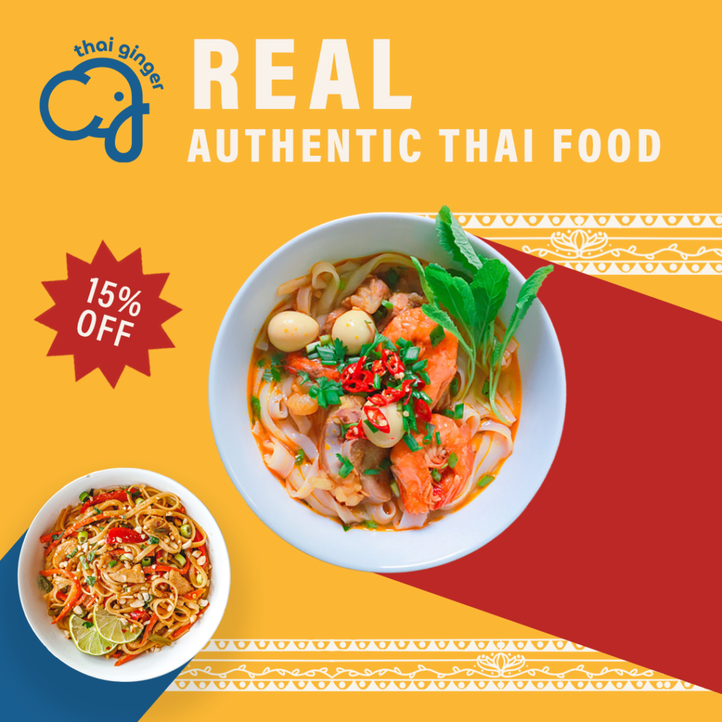
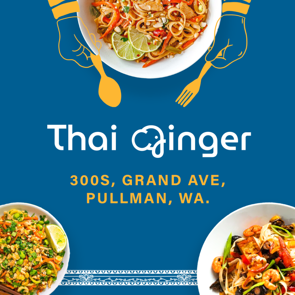
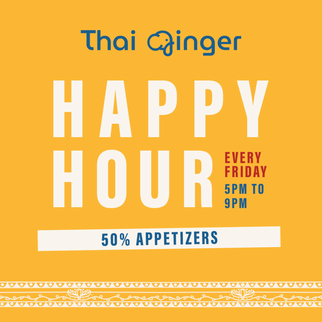
These social media posts have been designed for Instagram specifically, and they relfect the brand’s identity. To create a cohesive design, many elements that are similar to the posters have been used. Colour, art, and even some layouts have been reflected straight from the posters. This should allow customers to connect online content/branding with in-person branding. Deals and specials have been emphasised in these posts to account for the target market, which is going to be students in Pullman.
Packaging
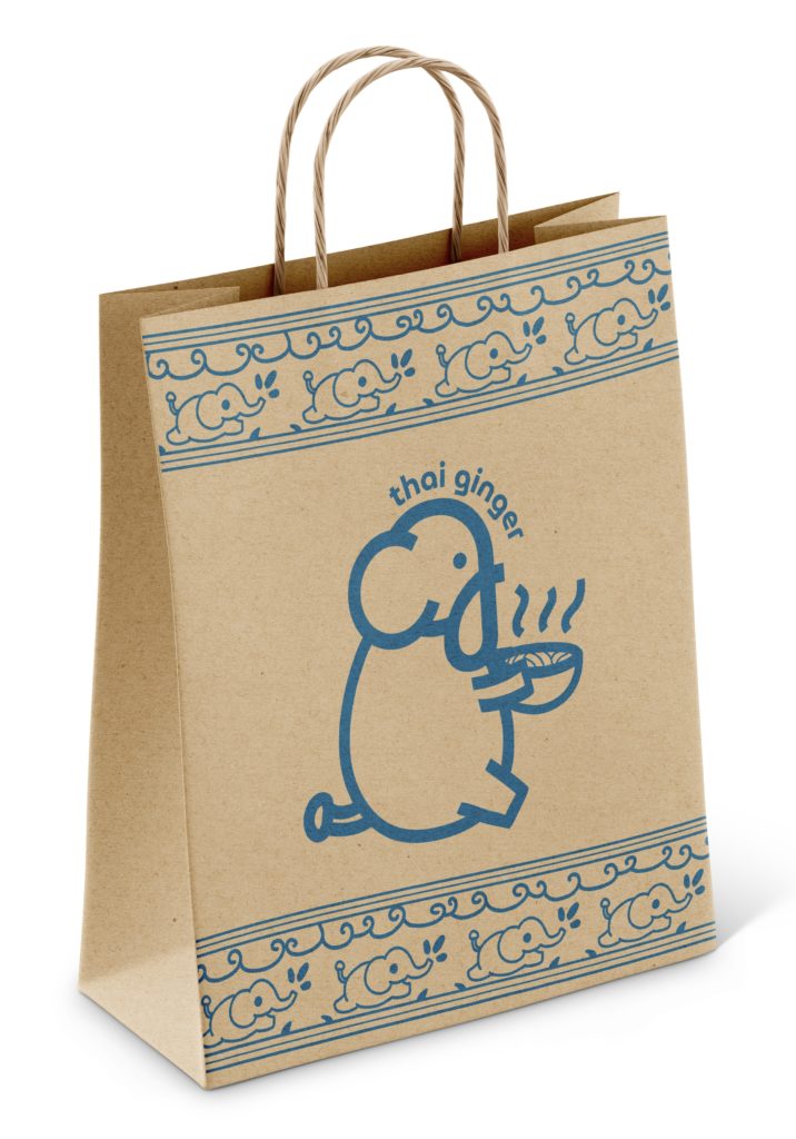
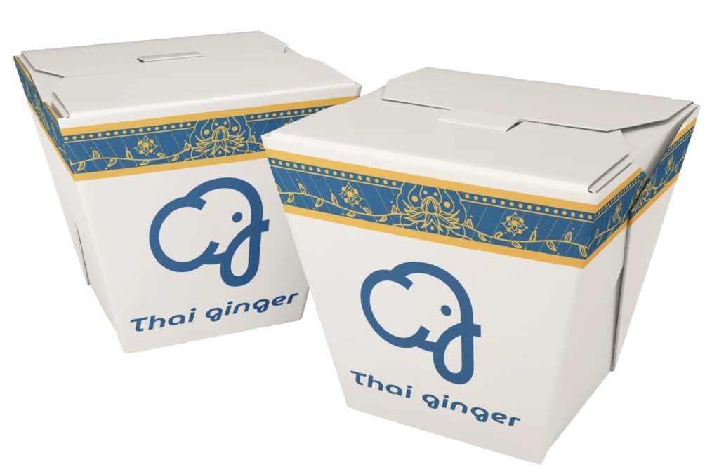
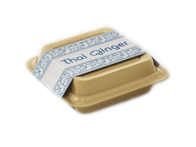
To compliment our new brand identity we created a set of to-go packaging options that reflect the new Thai Ginger brand identity.
On the packaging the logo is supported by our Thai pattern elements that can be found in other branding such as the posters and social media content. Lastly, the Thai Ginger bag has an extended version of the logo on it that will create a fun character for customers. We expect this character to be especially popular with college students.
